

An artist’s take on the pedagogical principles
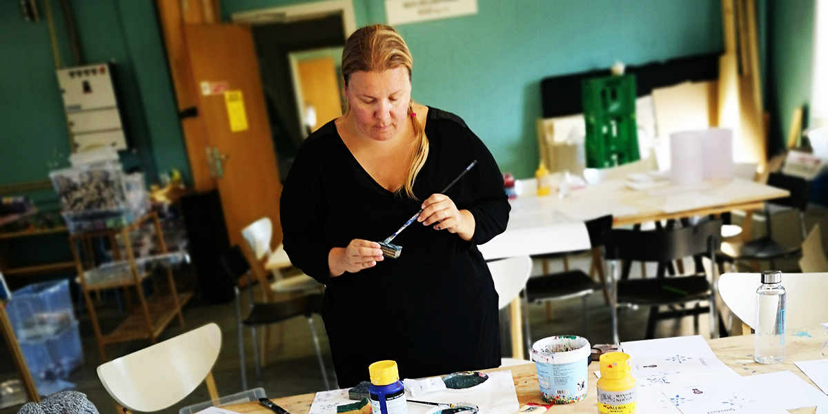
Graphic Designer Eike Einmann took on the challenge of illustrating the overarching pedagogical principles of the training centre for the Pedagogy for Change programme: DRH Lindersvold, in Denmark.
The task was far from easy but the final result is deeply satisfying – it captures the essence of each principle and displays the main message in a clear and interesting way.
We wanted to know more about the process, inspiration, meaning, and challenges connected with the project so we had a talk with Eike about it. We also discuss the principles and their application in everyday life as well Eike’s source of creativity.
Designing for Another Kind of School
Those posters were a project for The Necessary Teacher Training College in Tvind (DNS). The institution goes by the name “Another Kind of School” inspired by the unconventional teaching approach straying away from traditional education and putting the focus on “learning by doing”.
In order to better express their values and showcase their approach to teaching the school has adopted ten pedagogy principles which construct the core of their identity.
Eike’s task as an artist and designer was to take those ten principles and illustrate them by creating a poster expressing the essence of each of them. This meant creating a proper illustration that makes the idea easy to understand but also provokes people to think deeper about it and learn something from it.
The mind of an artist is a complicated and inspiring place and the creation of such posters takes a lot of skills, imagination, and energy put into the right direction. We wanted to take a look into the mind of the artist and discuss the principles themselves. After all, each successful design project is based on a clear understanding of the client’s values and trust in the message that needs to be presented.
Here is what Eike had to tell us about this project:
What was the process like when designing the posters?
The process of creating those posters was really interesting because it involved a lot of out-of-the-box thinking but equal inside-of-the-box constraints to keep the coherence in the ten posters.
All the posters are made in a similar way because they are part of one concept and entity. That’s why the style is preserved in all of them and they feature the same elements only used in different ways.
I had established guidelines to help me keep everything in the same style – bright colours and simple icon-type images, pop-art influences, and a lot of patterns and shapes for the different elements. Those guidelines gave me a way of putting limitations that still allow space for a lot of creativity but ensure things don’t get inconsistent or lose coherence.
I used the patterns and contrasting colours to direct the attention towards certain elements of each poster where the main message lies. The final result is simple on the first glance but if you take the time to investigate it properly you can find deeper meaning.
The out-of-the-box thinking was constantly applied to stay away from the overused style and compositions and make the arrangement playful instead of generic or too simple.
Can you go through each poster and tell us more about the idea, challenges, and process behind it?
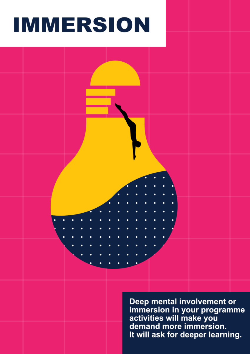
The lightbulb is the symbol of innovation and creativity. The idea behind this illustration is that you deep-dive into the programme activities. The learning process at DNS is not taken superficially but instead goes in-depth, students and teachers fully entrench into it to achieve the best results.
When creating the poster I played a lot with different shapes and sizes. I wanted to make different elements pop up well. That’s why the main element is the lightbulb and the others are smaller and placed within it to synchronize and create balance.
The dark blue colour is representing the water in which you are diving. It also stands for being protected and safe – this deep-dive into learning is a safe space where you are surrounded by a supportive community. This way you can be more confident in “jumping into the unknown” and approach it with passion instead of fear.
I also used a lot of bright colours (in all of the posters) because they speak of newness, youthfulness, and innovation – all things that are part of DNS. Those colours are also attractive and fun just like the education process at the school.
I tried to use imagery that everyone knows the meaning of but make it more quirky and interesting provoking the viewers to see it in another way and think about it more. I am relying on triggering interest by twisting what is considered “normal”.
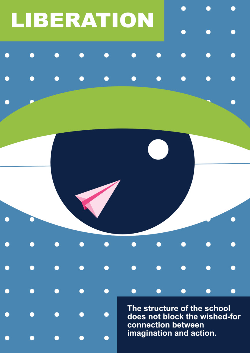
This poster has the eye as the main element – observing and understanding what is around you, taking in the environment and circumstances.
The other element is the creativity and imagination which should always be part of our lives and go hand in hand with reality – this is what the paper plane and the moon symbolize by being incorporated into the eye.
It is important to see the playful side of life apart from the “serious reality”. The poster is trying to tell people to approach different situations in an unconventional way and see different ways of doing things instead of only sticking to the “standard”. Imagination is liberating and this creative approach towards learning can lead to progress and development – that is the main message.
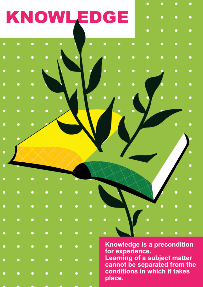
This poster is tightly connected to “learning by doing” – one of the most important and distinguishable values of the school. Everything you learn should be put into a practical experience which will teach you the real knowledge and skills. The theory is only a foundation for real learning (actually the real learning comes when you reflect on the experience but the point is practical action is fundamental).
This is what the poster represents. The book symbolizes the knowledge and the twigs growing through it are the growth, progress, and development created by education. This knowledge is also going out of the book hinting that it is applicable in real life and it doesn’t stay trapped between the pages, instead it reaches the real world – the practical part.
When it comes to colours I used contrasting ones (also in all other posters) to emphasize the important elements and make them visually appealing. For this particular one, I wanted something earthy and close to nature to highlight the practicality, movement, and action.
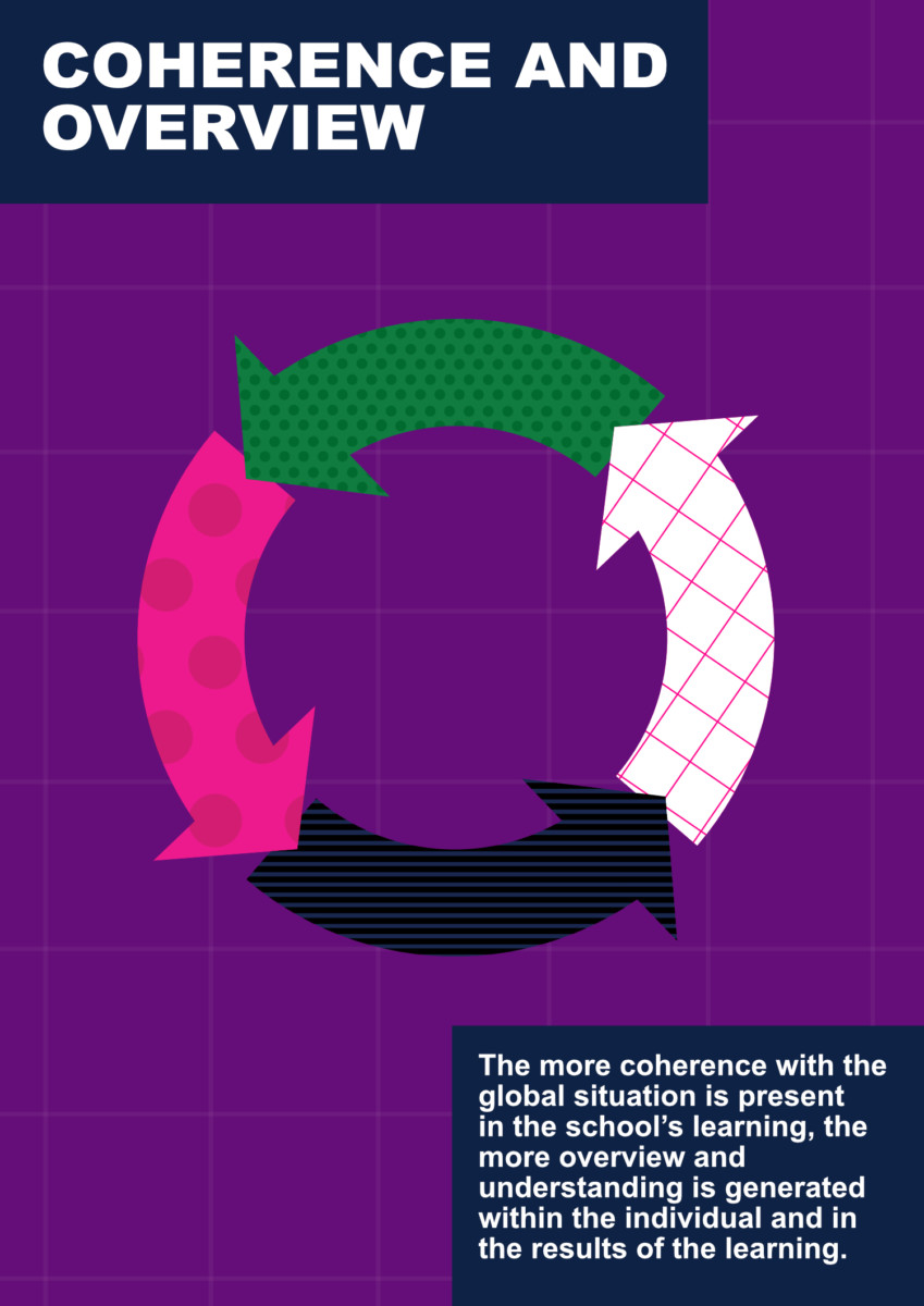
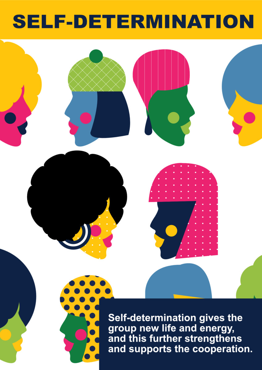
Here, the different shapes and patterns represent different entities put together in a coherent circle. This is showing that we can all work together despite being different from one another. We can keep our individuality and uniqueness and instead of this being a setback to collective work and cooperation it can be used to inspire them and improve the process.
The poster is about promoting individually and equality in a cooperative community. Doesn’t matter who you are, how you look, or where you come from – everyone in this community is equal.
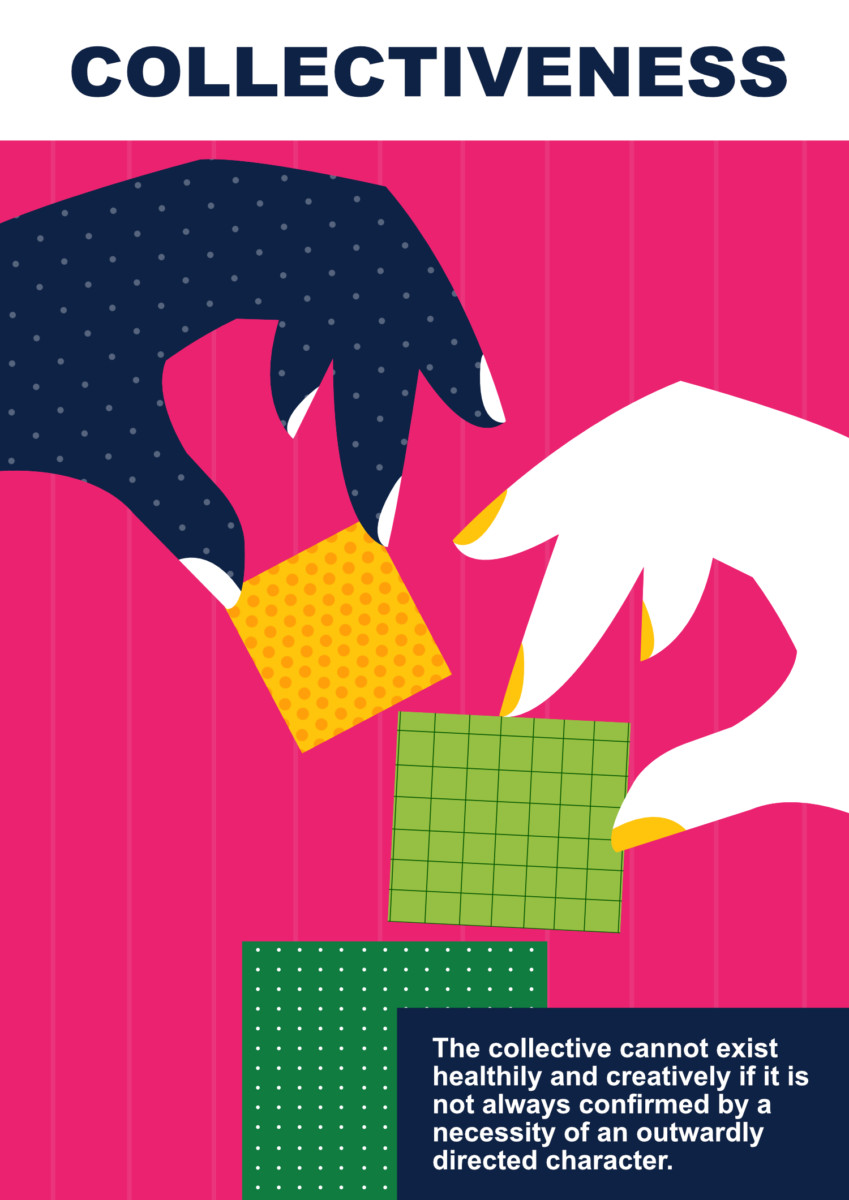
This poster is about working together and contributing to each other’s development by supporting and inspiring others. This is what the building blocks put by different people represent – they are building something together with mutual effort.
The different patterns also symbolize that different people are contributing to different things which is essential for success. You can’t expect progress if everyone is good at the same things – we need diversity in our world. Strong things are built by collective effort.
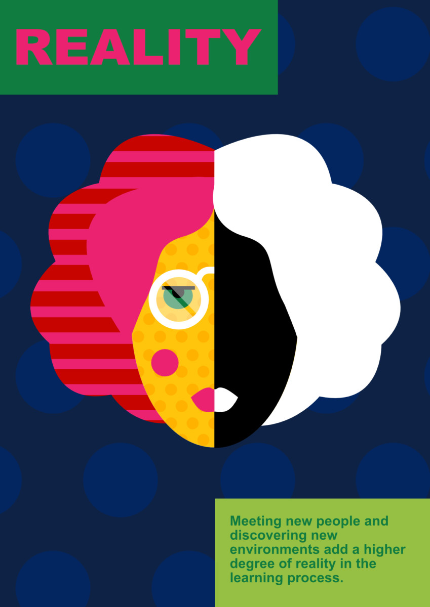
In the Reality poster, I wanted to represent two different kinds of people. It doesn’t matter if you are a colourful and energetic person, modest, quiet, or confident, etc. – it is about discovering each other, embracing and appreciating differences.
It also sends the message that we should not stick only to the things we know but explore diversities and get out of our comfort zones. Usually, we as humans prefer to stick to people who are similar to us because it is easier but in that way we limit ourselves greatly and restrict the flow of new ideas and learning. We need to be open to people who are not like us because we can learn a lot from them. This applies to age, social status, race – everything, we need to get out of our bubbles and embrace the world as it – different and colourful.
That is why the poster shows two different sides of a person. It also promotes being proud of your identity and not hiding it because people won’t accept it.
The school is an international community involving a lot of cross-culture interaction and travelling to new places so I think it fits very well with their identity.
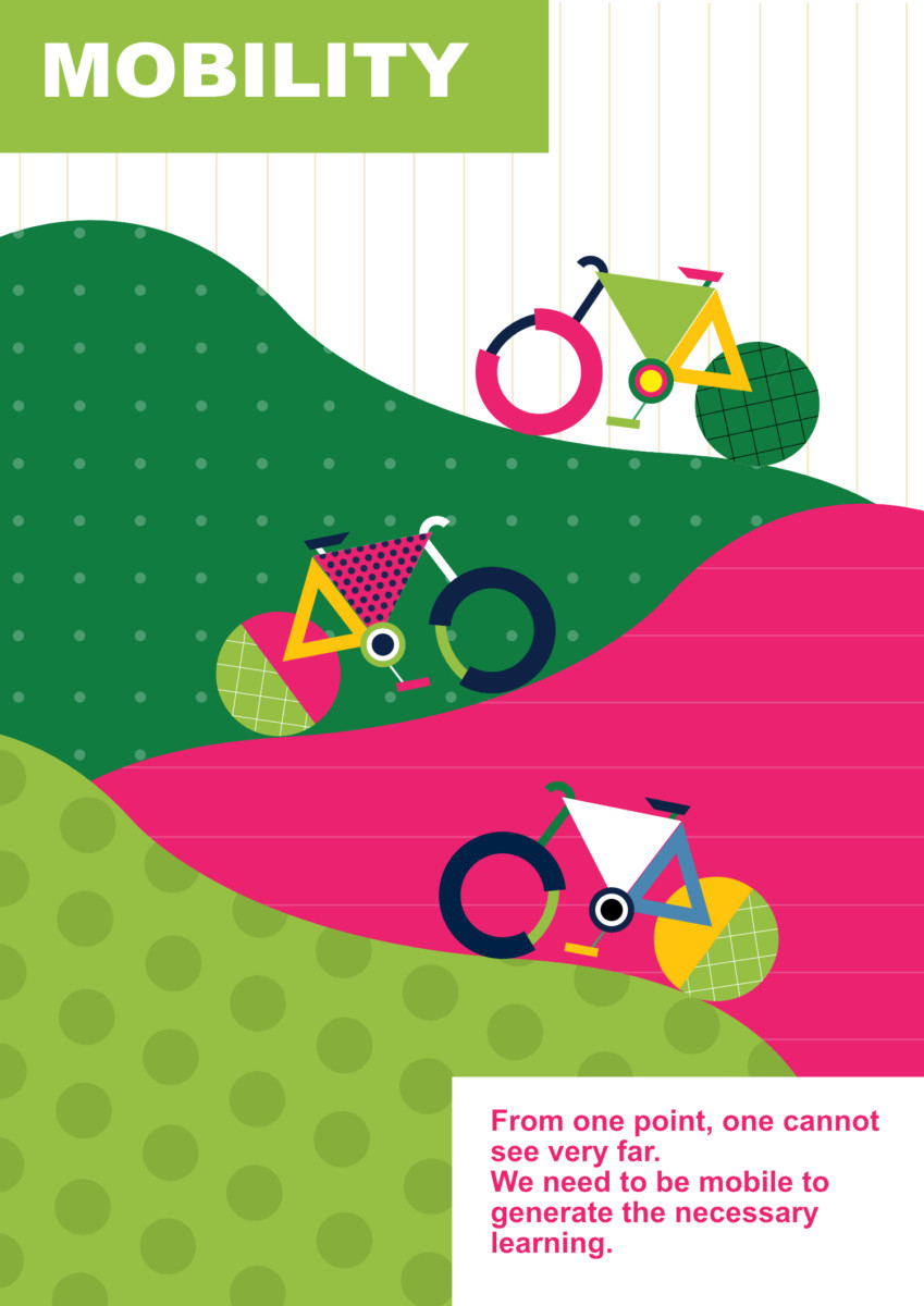
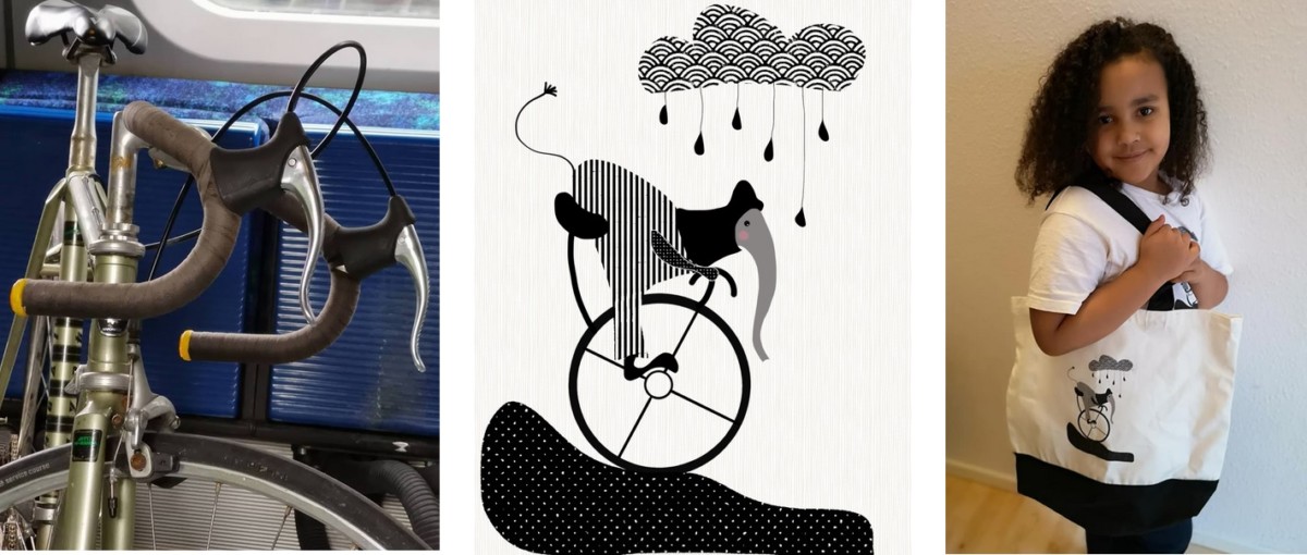
This one is all about movement. I chose bicycles as a symbol of mobility for several reasons.
First of all, biking is very good for people’s health and it promotes physical movement. Also, this is a better alternative to cars and other transport from an environmental point of view.
The poster shows moving towards something – a goal or an idea. When you are only learning a theoretical foundation with books you are trapped and limited to a certain extend. When you are out in the world you see things that you usually do not expect or cannot predict and this teaches you a lot and helps you develop. It is also connected to getting out of your comfort zone which leads to true progress.
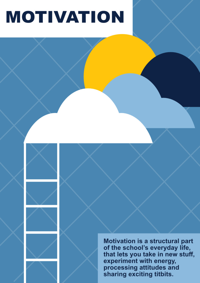
The ladder in this poster is an epitome of going up towards your goals and staying motivated to achieve more. The environment and community at the school are highly motivating and supportive and this is what I tried to incorporate in the poster. Taking up new challenges and not being afraid of them is another part.
Sometimes you think a certain goal or dream is impossible but it is important to find the motivation and belief in being able to do it. This is the way to reach new heights.
The image in this poster shows different people communicating with each other, sharing information and ideas, supporting each other. Being together in a community means supporting each other and giving each other strength.
When we see someone who is positive it is easier to get “contaminated” and boost ourselves as well. I used different colours and patterns to emphasize on the diversity again – as I said all the posters are connected and diversity is one of the core values of DNS so it was important to point it out frequently. I didn’t want the posters to look one-sided so I used a lot of different elements and patterns to make them “same but different”.
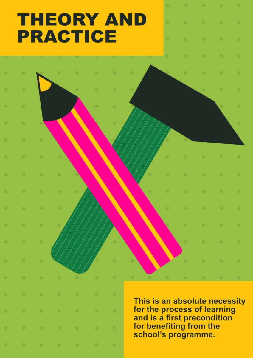
Here, we come to the method of learning by doing again. Everything we learn we need to put into practice and test for ourselves otherwise we can’t truly understand and “learn” it. I think the image of pen and hammer represents the learning and practice quite well. It is simple symbolism but I tried to make it more fun and playful with the colours, patterns, and composition.
The background patterns hint about the building papers which is another small detail to support the idea.
Which posters do you like most?
I like the Liberation poster a lot. I tried to play with the space and arrangement of elements in an unexpected and creative way and I think it turned out well. It is interesting even though it is simple – if you look carefully you spot details that support the message. I also think the colours work well together which is important for me.
I like the Immersion one most in terms of an idea. It shows the message well in a fun way which is not the stereotypical overused imagery. Self-determination is my favourite in the visual aspect – it shows the style very strongly. Colours and patterns work well together.
I tried to make them all fun and playful. The goal was to reflect on childhood and the child-like mind that we should never lose even when we are adults. I think the posters deal with life’s seriousness through playfulness and I wanted to show it with the visuals. The world needs more colour.
What were the biggest challenges when making the posters?
The main challenge was connected with finding the right way to present the message of each principle. Also, I wanted to stay away from the overused and generally known imagery and stock-photo type of posters that we see everywhere – I wanted to create something new, different, and unique for the school that also captures their image and values. It had to be specific but at the same time easily understandable.
The process was not easy, of course, and there were a lot of changes before creating the final result. For some of the posters, I had different ideas initially but then I realized they are too generic so I had to push myself harder to elevate those ideas and make them more interesting.
A tricky part was creating something deep and meaningful with just one simple image. The main thing about those posters is minimalism – I didn’t want to stuff them with many elements. It had to be something that you look at and immediately understand. One image presented in a simple way yet making you think and giving room for analysis as well.
Where do you usually get your inspiration from as an artist?
For me creating art is an escape from real life and the normal world. I am getting easily bored with everyday lifestyle and art is giving me a way to cope with that and make it more interesting. You know how people watch fantasy movies to escape their everyday life for a while? Art is my method.
Also, I truly love creating. Making art makes me feel like I have done something useful and I have put something new in the world which is a great feeling. I am creating art for other people to see but firstly I am creating it for myself – that’s the key to my work.
I like to create things that don’t look regular – shapes that don’t look right, colours that don’t make sense – I use those elements to make things that look nice and visually appealing.
Of course, I also get inspired by other artists, I love going to exhibitions and galleries and browsing artbooks for ideas. When I find something I really like I think about what makes me so happy in it. This also goes for my everyday life – I take things that make me happy as a foundation for my work. For example, I love nature and I am heavily inspired by it. I am fascinated by the colours in nature – during the summer or winter, even during the night, the effects of light – everything is fascinating me and it affects my art.
I was a photographer before I moved to design and this is when I started paying attention to light and the amazing effects it creates, the way it changes shapes and moods is amazing.
Do you think the ten pedagogical principles can be applied to other areas of life?
I think the pedagogy principles can be easily implemented in every aspect of life. They are not limited to learning or school. You can find a way to use them in every situation and I think they send a powerful message and a great reminder for everyone.
Those posters are like a post-it note you put on your mirror as a reminder but the message is stronger and concerns life in general, not just a thing you need to do tomorrow.
What has influenced your art the most?
I am coming from a multicultural background. I have grown up with different languages and cultures in my family and I also married to a Zambian – another culture in my life.
In my childhood, I was also able to look at things from different sides and angles because of my surroundings. During my life, I have seen discrimination and white privilege up-close. This has been a huge part of my life and I had to make a stand towards those things.
That’s why the art I am making is very diverse – it is embracing all kinds of people, cultures, ages, sexes, races, and so on in an equal way. I want to send a message with it. Due to other personal experiences, I put a lot of focus on untraditional looks and try to promote self-appreciation and respect. Everyone deserves that.
Ten Reminders
The ten pedagogical principles are used as a core element supporting the community and expressing the values of DNS. However, those principles find their application in all areas of everyday life easily. Remembering the importance of diversity and embracing differences, supporting each other and striving for cooperation instead of conflict, incorporating creativity in “the harsh reality” – those are all important things to keep in mind regardless of our age, occupation, or situation.
We hope you find them useful.
I think the posters deal with life’s seriousness through playfulness and I wanted to show it with the visuals. The world needs more colour.
– Eike Einmann
Eike Einmann - Designer and Illustrator
Learn more about the artist responsible for the posters and explore her colourful work.
The principles can also be easily applied in every situation of life. They are a powerful message and a relevant reminder for everyone – like a post-it note you put on a mirror but it gives you a message about life in general, not only a thing you need to do tomorrow.
– Eike Einmann
DNS – The Necessary Teacher Training College
Learn more about DNS.
The ten pedagogical principles of DNS
1. Both theoretical and practical studies
2. A high degree of reality
3. Coherence and overview
4. The programme generates motivation
5. Immersion and work of the activist educator
6. Self-determination
7. The collective is the partner of aloneness
8. Liberation through coherence of conception and action
9. Mobility is a precondition for learning much
10. Knowledge
The poster is about promoting individually and equality in a cooperative community. Doesn’t matter who you are, how you look, or where you come from – everyone in this community is equal.
– Eike Einmann

More
blog posts
about
PEDAGOGY
How to tackle intolerance
Being an active bystander means becoming aware that inappropriate or even threatening behaviour is going on and choosing to challenge it. Collective action is the way forward.
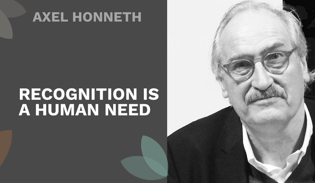
Axel Honneth
Through recognition, human beings develop self-confidence, self-respect, and self-esteem. The theory of recognition was developed by German philosopher and educator Axel Honneth.
Mónica shares her experience
Mónica just finished the Pedagogy for Change programme and we asked her to share some of her considerations and main takeaways from her experience of practising and studying social pedagogy in Denmark.
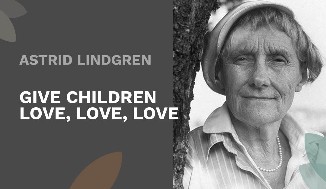
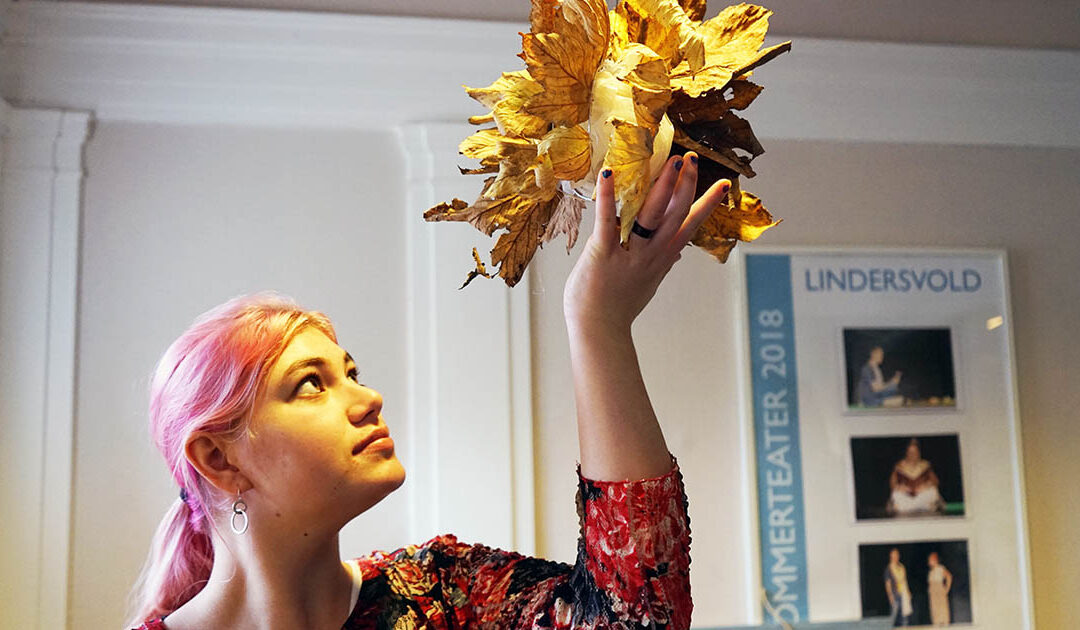
Astrid Lindgren
Astrid Lindgren’s thoughts about children were provocative in the 1940s, and her approach to childhood as a phenomenon is progressive, even today.

“Zone of Proximal Development” exemplified
In this blogpost, we exemplify how the theory of the “Zone of Proximal Development” can be implemented in real life when working in the field of social pedagogy.
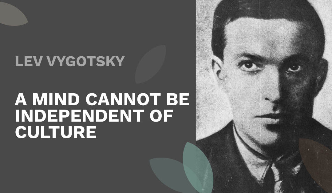
Lev Vygotsky
Interaction with peers, imitation, collaborative learning and other social interaction is key to how the human mind develops, according to Russian psychologist Lev Vygotsky.
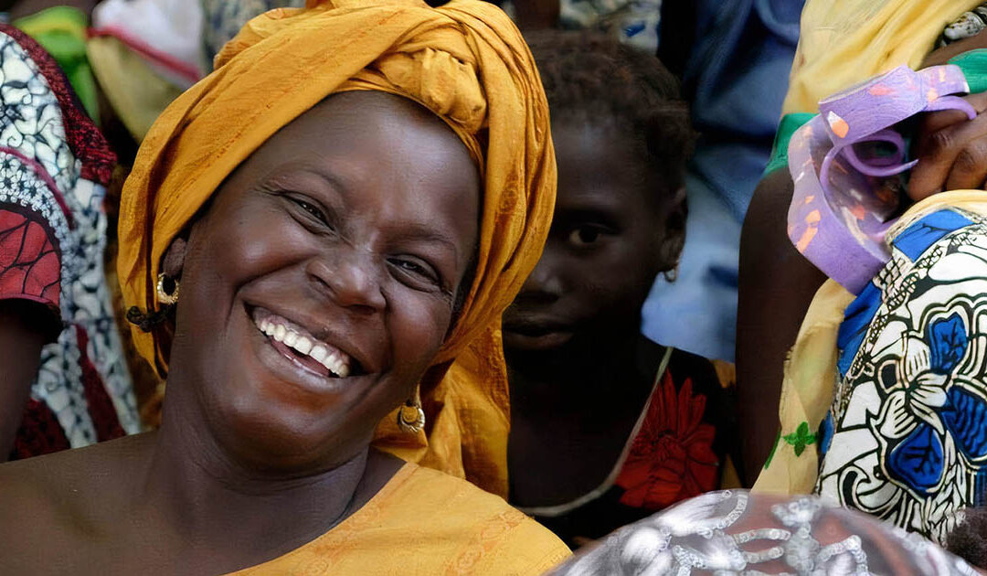
Social Pedagogy in Denmark
Scandinavian social pedagogy is known for its holistic practice which combines “head, heart and hands” – theory, empathy, and practice. A core value is respecting the individual’s rights.
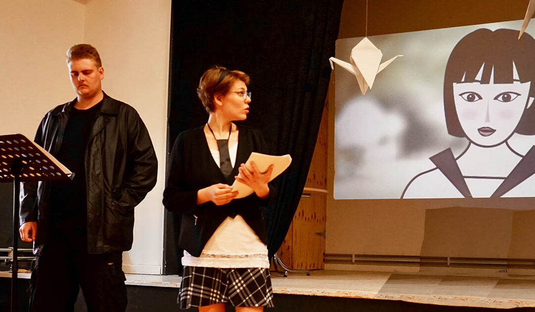
Learning through theatre
Theatre is an important pedagogical tool which provides an opportunity for us to explore realms and realities outside of the classroom, without having to travel.
Artful expression in pedagogy
Art is a pedagogical tool which provides an opportunity for everyone to work with open-ended solutions rather than striving for conventional error-free essays or science reports.
Maya Angelou
In times of injustice and hardship, Maya Angelou’s call for humanity, unity and resilience teaches us many important life lessons. Her works inspire hope through action.
Let’s go to Malawi!
We are working on an extension of the Pedagogy for Change programme where participants can join sustainable development projects in the Global South, after their 12-month course.
James P. Comer
“No significant learning can occur without a significant relationship.” Really? Does Dr. James Comer mean that students need to be close to their teacher to learn something?
The Common Third
Creating an authentic learning space through a truly interesting, shared activity, is highly beneficial. The Common Third works as an ‘equaliser’ and is an important pedagogical tool.
Jean Lave
Jean Lave is a social anthropologist and learning theorist who believes that learning is a social process, as opposed to a cognitive one – challenging conventional learning theory.
Social learning in practice
We are social beings and therefore learning is an intrinsically social process. Learning takes place in many kinds of arenas, some of them arranged, where we interact with others in different contexts.
Søren Kierkegaard
Making choices and taking action are at the very core of existentialism. By taking on these responsibilities, as human beings – we find the meaning of life.
READ MORE


